A website can look polished and still leave people wondering what to click, what a form is asking for, or whether their message actually reached someone. When I consider using AI to improve website usability, I start with those small moments of uncertainty. A prettier layout is useful only when the visitor can complete the task.
AI can help me compare wording, organize observations and question a proposed layout. It cannot tell me, from a screenshot alone, whether a real person can complete a purchase or whether a contact form delivers an email. Here is how I would use it as part of a practical WordPress improvement workflow.
About the examples: the service website and form examples below are illustrative demonstrations, not a client case study or a report of measured results.
1. Choose one visitor task before asking AI for ideas
“Improve my website” is too broad to produce a useful plan. I would choose a task such as requesting a quote on a phone, finding a product’s delivery information, or locating an existing subscription. Then I would write down where the task starts and what successful completion means.
For a service business, success might mean that a visitor understands the offer, finds the enquiry form, submits it and sees an accurate confirmation. For WooCommerce, success might include choosing a valid variation and completing checkout. These tasks need different evidence and different technical checks.
I would also record constraints: the existing page builder, supported languages, required business information, accessibility needs and the team’s ability to maintain the result. A suggestion that requires a new plugin, paid licence or complex custom code should carry that cost in the plan.
2. Gather evidence that AI can actually interpret
I would prepare a short evidence pack: the public page URL, screenshots at relevant screen sizes, the visible headings and buttons, a description of the task, and notes about observed problems. If a button fails, I would describe the actual failure separately from my guess about its cause.
Before sharing anything with an AI service, I would remove names, email addresses, order details, credentials and private messages. A screenshot can expose customer information even when the main page looks harmless. Public page content and synthetic examples are usually enough for an initial review; private production records need an approved handling process.
| Observation | Question to investigate | Verification |
|---|---|---|
| The mobile menu covers the enquiry button | Can the visitor close the menu and reach the next action? | Open, close and navigate using touch and keyboard |
| A field is labeled “Details” | Does the visitor know what information to provide? | Ask someone to explain the field without coaching |
| The form displays “Success” | Was the submission accepted and delivered? | Check the submission record and destination inbox |
This distinction matters. AI can help identify ambiguity in “Details.” A failed email delivery needs a technical investigation, such as the steps in my WordPress contact form email guide.
3. Ask for observations and alternatives, not a verdict
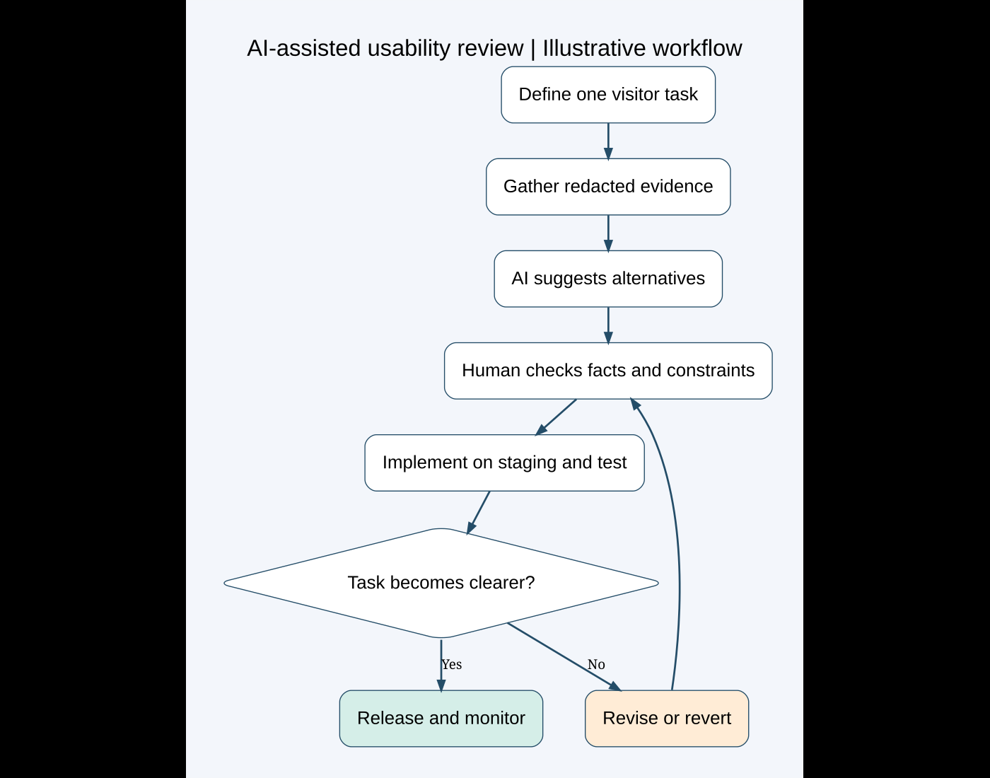
I would give AI a constrained prompt that separates facts from assumptions. This makes the output easier to review and reduces the chance of treating an attractive suggestion as evidence.
Review this public service page for the task “request a project quote on mobile.”
Use only the supplied text and screenshots.
Separate observable issues from assumptions.
For each issue, propose one small change, explain the tradeoff,
and give a test that could confirm whether the change helps.
Do not invent visitor behavior, conversion numbers or business policies.
Flag anything that requires checking the live site.
I would then prioritize findings by task impact and confidence. A broken submit button comes before a slightly awkward heading. A confirmed missing label comes before speculation that “users dislike this color.” AI-generated priority scores are opinions unless they are supported by real evidence.
I would keep a small change log with the original state, proposed change, reason, owner and acceptance test. This also gives an agency or another developer a clear handover instead of a long chat transcript.
4. Improve form wording without weakening the form
In an illustrative enquiry form, “Details” could become “What would you like help with?” A short instruction might ask for the website URL, the main problem and the desired outcome. I would mark optional fields accurately and avoid demanding a phone number when the business does not need one.
I can ask AI for three versions of the label and help text, then choose wording that fits the actual service. I would reject any version that promises a response time the business has not agreed to. Friendly copy should make the process easier to understand.
W3C’s form notification guidance recommends clear feedback and correction instructions. Applied to this example, “Invalid input” is less useful than “Enter an email address, such as name@example.com.” The error should identify the relevant field rather than depend on a red border alone.
The implementation needs its own checks: a programmatically associated label, appropriate field type, understandable required-field indication, and errors that assistive technology can discover. I would inspect the generated markup rather than assume the builder’s visual preview proves these relationships.
A confirmation should match what the system knows. If the site only knows that the submission was accepted, it should not say that a person has already read it. If sending fails, the visitor needs a truthful message and a safe way to try again. AI can suggest that wording, but the developer must connect it to the actual form states.
5. Make navigation match the visitor’s question
For the demonstration service site, I would compare the menu against questions like “What do you build?”, “Can I see your work?” and “How do I start?” AI can group existing pages and suggest shorter labels. I would supply the actual page inventory so it does not invent destinations.
I would check each proposed label against its destination. “Pricing” should not lead to a generic contact page without explaining how quotes work. A menu that reads well but sends people to the wrong place creates new confusion.
On a one-page site, an anchor link can be appropriate. On a site with detailed service pages, a separate destination may be more useful. I would also test sticky headers, anchor offsets, browser back navigation and mobile menu closing. These are behavior checks that a text-only AI review cannot perform.
For multilingual sites, I would review the task in each supported language. A translated label may be longer, and right-to-left layouts need their own checks. I would ask a fluent reviewer to assess meaning and tone instead of assuming an automatic translation is ready to publish.
6. Treat AI-generated layouts as prototypes
An AI-generated HTML page can be a useful starting point for discussing hierarchy. It may also contain placeholder links, visual-only form controls and decorative purchase buttons. I would inventory those elements before converting the design into WordPress or Elementor.
My HTML to WordPress planning guide covers the wider project decisions. For usability, I would identify what must remain editable, which components should be reusable, and which actions need server-side functionality. Copying a screenshot closely is only one part of the work.
I would favor a small shared set of headings, buttons and spacing rules over separate styling for every section. Reusable components make later changes easier to review. If AI proposes custom JavaScript for a simple interaction, I would first check whether the existing builder or a native HTML element can do the job with less maintenance.
7. Verify the change on staging and with people
I would implement a limited set of changes on a staging copy and compare the same task before and after. My WordPress staging guide explains how to keep that testing separate from live changes.
W3C’s Easy Checks is a useful starting point for reviewing accessibility, but it is not a complete accessibility evaluation. I would combine initial checks with task-specific testing and specialist review where the project requires it.
- Use the keyboard to reach the menu, primary action and form controls; confirm that focus is visible.
- Check small screens and text zoom for hidden controls, overlapping content and horizontal scrolling.
- Submit valid and invalid form entries using synthetic data; inspect the resulting messages and delivery.
- Confirm that chat widgets and cookie banners do not cover the task.
- Check the same flow in relevant languages and browsers.
- Ask representative people to attempt the task without hints, and record where they hesitate.
A few observed sessions can reveal problems; they do not establish a statistically reliable conversion increase. I would record what was observed, the test conditions and the limits of the sample. If a change creates a regression, I would revise or revert it.
8. Measure the outcome that matters
Depending on the site, I would track completed enquiries, valid submissions, task completion or checkout errors. A button-click event alone does not prove that the visitor succeeded. Measurement should also distinguish genuine enquiries from spam and respect the site’s consent and data-handling requirements.
For a low-traffic site, I would avoid declaring a winner from a handful of sessions. Seasonal demand, traffic sources and concurrent changes can all affect outcomes. A controlled comparison needs enough data and a clear plan; qualitative feedback can still guide practical improvements when traffic is limited.
When AI is useful, and when I would stop
I find AI useful as a source of alternatives: shorter instructions, clearer headings, better review questions and a first pass through a page inventory. I would stop relying on it when the decision requires facts it does not have, such as payment behavior, visitor research or contractual promises.
Adding an AI chatbot is also a separate project decision. It needs approved information, clear limits, a human contact route and ongoing maintenance. A simpler form or clearer navigation may solve the immediate problem with fewer moving parts.
If you have a WordPress, WooCommerce or AI-generated website that looks good but feels difficult to use, share the page and the task your visitors need to complete. I can help turn that into a focused improvement plan, with clear implementation and verification steps.
Featured photo: Hal Gatewood on Unsplash. Diagram created for this guide. Technical references reviewed October 5, 2026.
Need help fixing this on your website?
Need help fixing this on your website? Chat with me on WhatsApp.